What Color Goes With Navy Blue Home Decor
Let’s be real navy blue is the Beyoncé of home decor colors. It’s bold, it’s classy, it doesn’t scream for attention but still manages to totally steal the show. But here’s the kicker: choosing the right colors to pair with navy blue can make or break your entire vibe. Like, one wrong move and suddenly your “modern luxe” turns into “1990s corporate boardroom.” Yikes.
So if you’re sitting there staring at your navy sofa or accent wall wondering, “What the heck do I pair this with?” don’t worry. I’ve got your back, friend. I’ve danced this navy tango in more rooms than I care to admit, and I’m here to share the actually good combos that work.
1. Crisp White: The Classic Power Couple
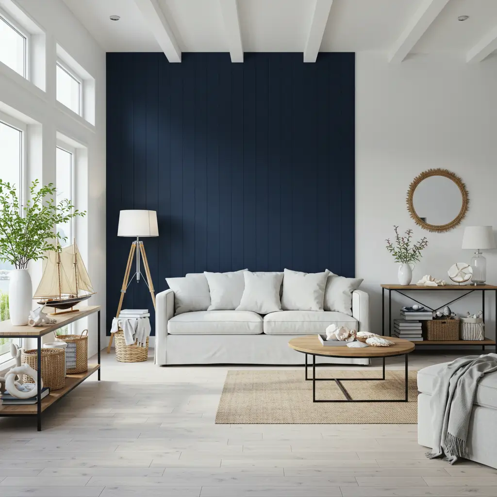
Okay, let’s just get the obvious one out of the way. Navy blue + white is like peanut butter and jelly it just works.
Why It Works:
- Clean and timeless.
- Makes navy pop without feeling heavy.
- Gives off those coastal, nautical vibes without screaming “Ahoy, Captain!”
Quick Tip:
Use bright white for a more modern, high-contrast look. If you’re into softer aesthetics, go for warm whites or even creamy off-whites.
Ever tried navy cabinets with a white marble backsplash? Chef’s kiss. You’ll feel like you’re living on a Pinterest board.
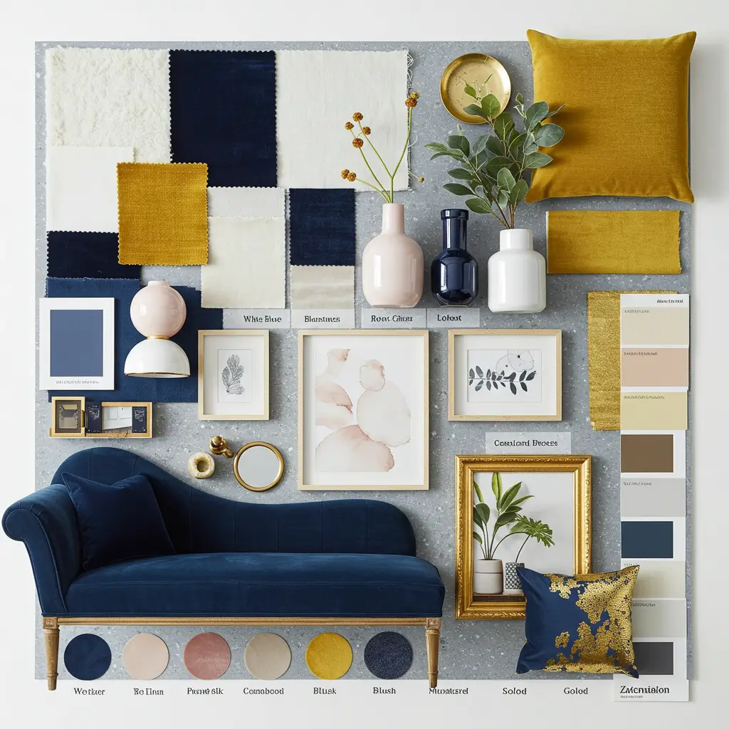
2. Mustard Yellow: The Unexpected MVP
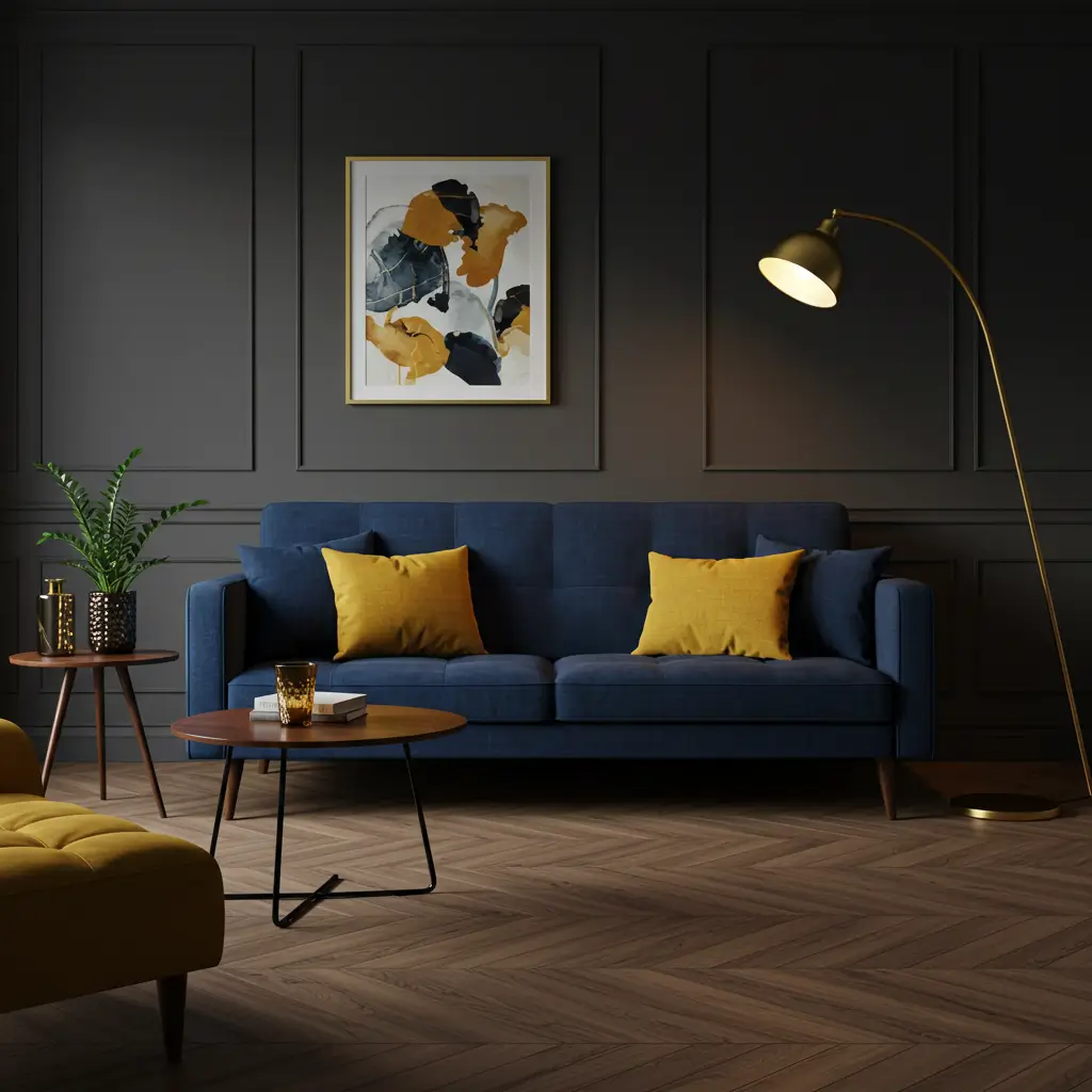
Now this one? It’s for the brave souls who like their spaces with a little edge.
Why It Works:
- Warm mustard tones balance out the coolness of navy.
- Creates a rich, retro-modern vibe (yes, that’s a thing).
- Adds a playful pop without being tacky.
Imagine a navy sofa with mustard throw pillows. Or a navy accent wall with a mustard velvet armchair. FYI, your guests might never leave.
3. Soft Gray: Cool, Calm, and Collected
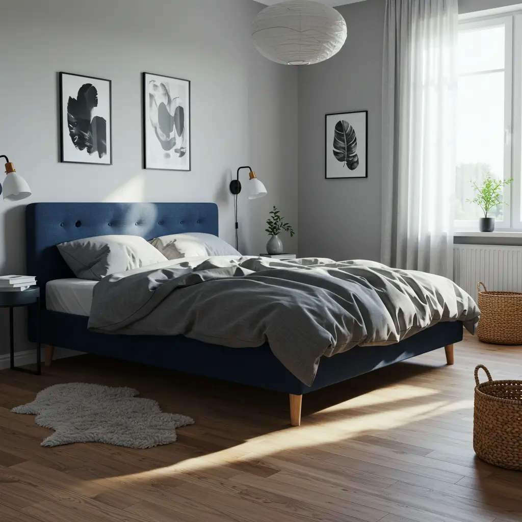
If navy and white are the bold extroverts, gray is the chill friend who always knows what wine to bring.
Why It Works:
- Muted tones keep the room feeling grounded and cohesive.
- Works especially well in bedrooms and offices for a serene atmosphere.
- Pairs nicely with metallics (more on that later).
Light grays work great for walls and large furniture, while charcoal grays can offer moodier depth in smaller accents. Just avoid going too dark or you risk creating a cave… unless that’s your thing. No judgment.
4. Blush Pink: Don’t Knock It Till You Try It
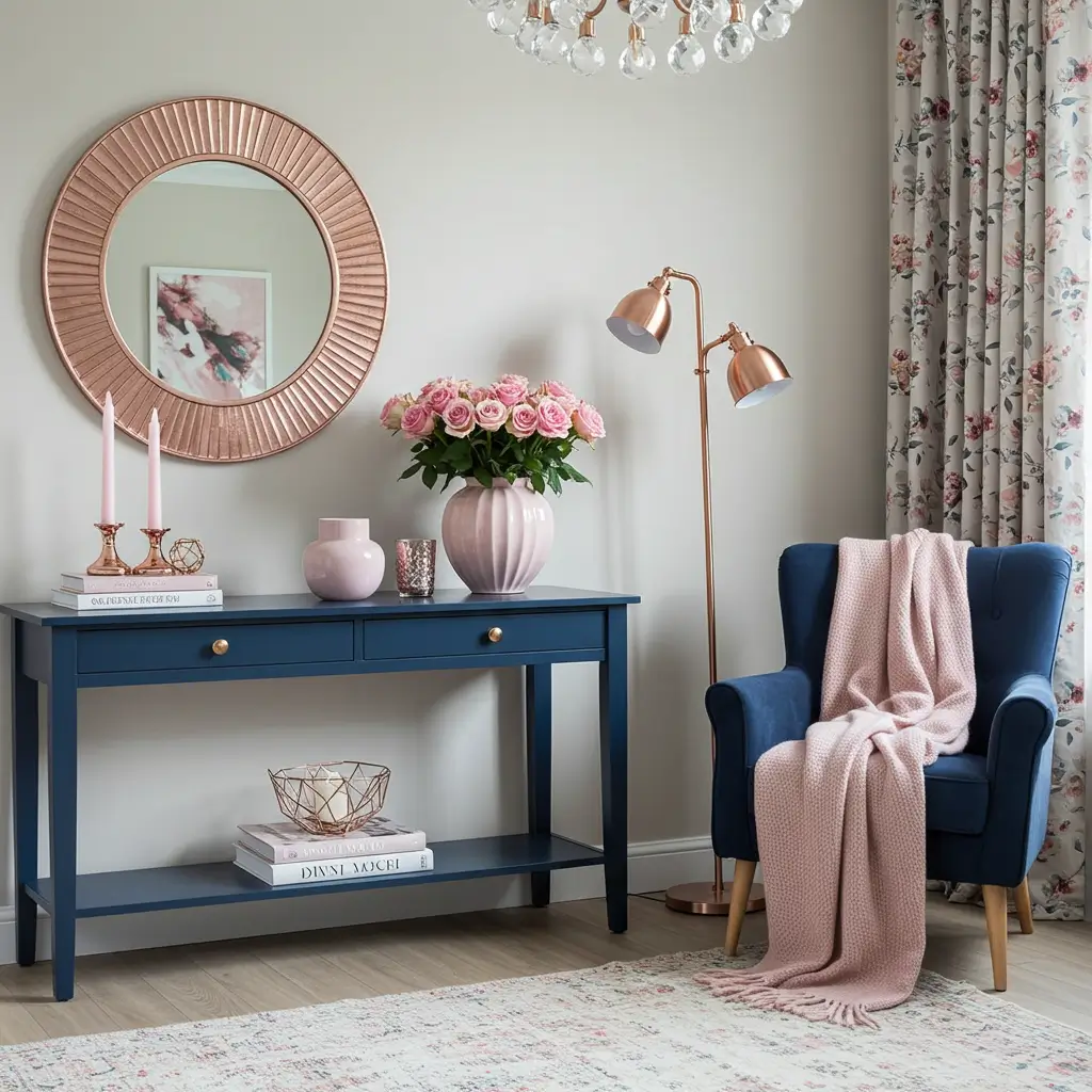
I used to think pink was just for nurseries or Instagram influencers. I was wrong. Blush and navy? Total power move.
Why It Works:
- Creates a delicate yet sophisticated contrast.
- Gives navy a bit of romantic flair.
- Feels feminine without losing that grown-up edge.
Try blush curtains or a rose gold mirror over a navy console. It’s subtle, it’s stylish, and—IMO—it totally slaps.
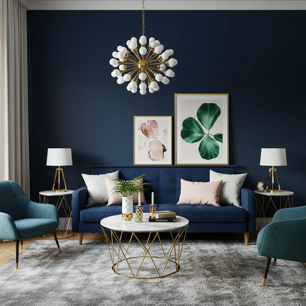
5. Emerald Green: For That Luxe Look
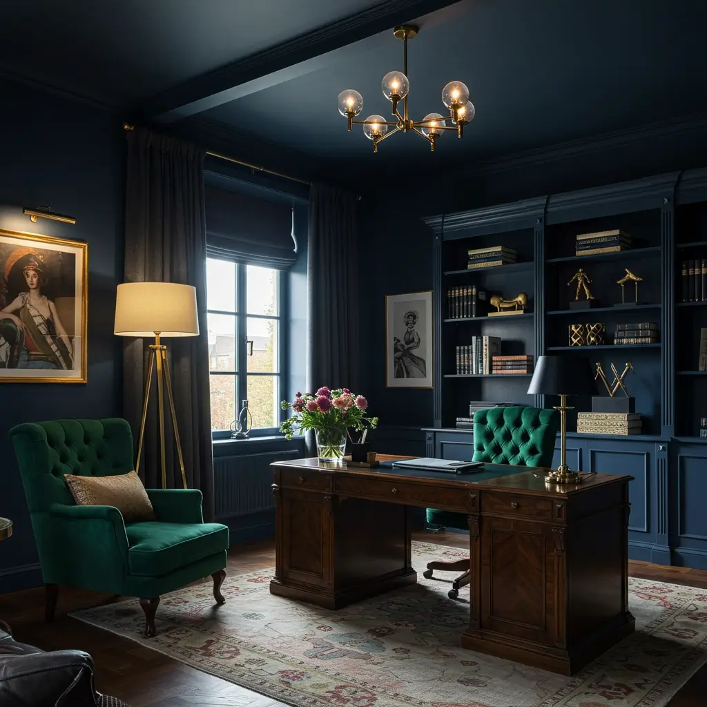
Let’s talk about that moody jewel-tone magic. Navy and emerald feel like old money without the weird country club energy.
Why It Works:
- Both are rich, saturated colors yet they don’t compete.
- Feels luxurious, like you should be sipping whiskey in a leather chair.
- Works well in dining rooms, offices, and reading nooks.
Pro tip: throw in brass or gold accents and you’ve basically created a set from Succession. Minus the family drama (hopefully).
6. Tan and Natural Wood: Earthy and Balanced
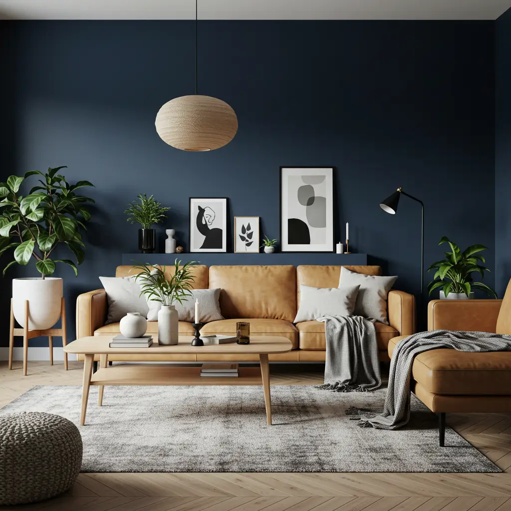
Want to avoid your navy space feeling like a stormy night? Enter warm neutrals.
Why It Works:
- Adds organic warmth that softens navy’s intensity.
- Perfect for Scandi-inspired spaces.
- Creates a cozy, down-to-earth palette.
Think: navy blue accent wall + tan leather sofa + light oak coffee table. Add a few plants and boom you’re officially the cool minimalist friend.
7. Gold & Brass: Glam Without Going Full Gatsby
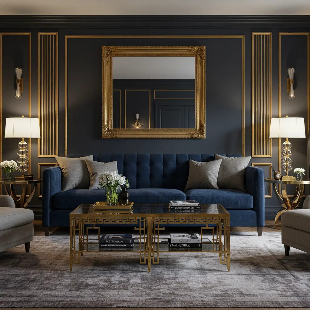
Navy and gold = drama done right. Not like high school drama—more like Oscar-winning drama.
Why It Works:
- Adds a touch of elegance and shine without overpowering.
- Looks especially good with velvet textures.
- Works well in both modern and vintage-inspired decor.
Use it sparingly brass handles, a gold-framed mirror, or metallic table legs. Too much and you’re suddenly in Liberace’s living room. A little goes a long way.
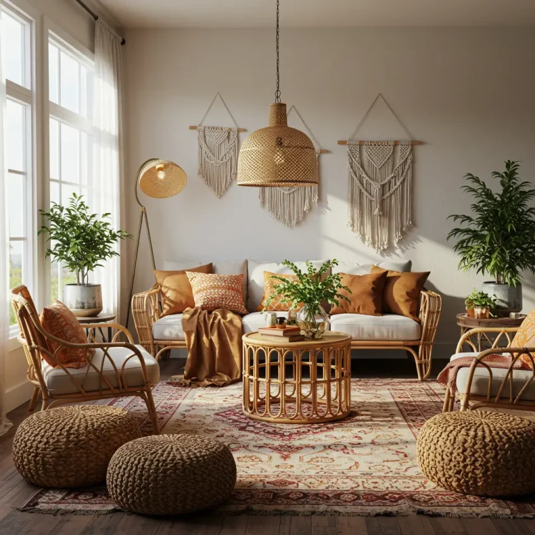
8. Burnt Orange or Terracotta: Bold and Earthy
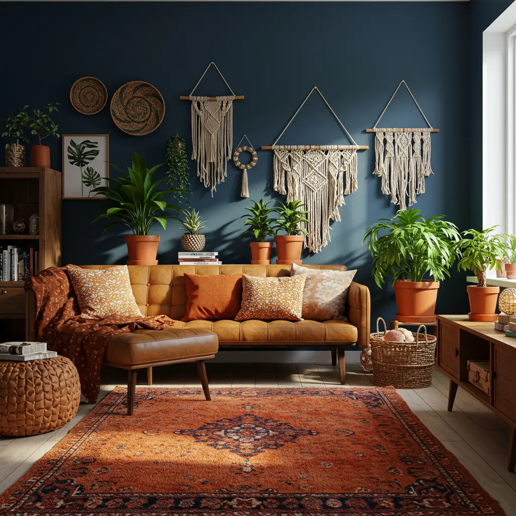
Looking to warm things up a bit? Burnt orange and terracotta bring in that cozy, grounded vibe.
Why It Works:
- Feels natural but still colorful.
- Great for fall-inspired palettes.
- Pairs well with textures like linen and leather.
A burnt orange rug under a navy blue sofa? YES. Or terracotta planters against navy walls? Double yes.
So… Which Combo Should You Pick?
Honestly, it depends on the vibe you’re going for.
- Want crisp and clean? Go with white or gray.
- Feeling dramatic and moody? Try emerald or gold.
- Craving warmth and comfort? Say hello to mustard, tan, and terracotta.
- Trying to impress your in-laws or your Instagram followers? Blush and brass are calling your name.
The beauty of navy is that it’s weirdly flexible. It plays well with tons of colors so don’t be afraid to experiment a little. Just maybe… leave neon green out of it, yeah?
Final Thoughts: Navy Is the New Neutral Sort Of
So, what color goes with navy blue home decor? Honestly? Almost anything, as long as you balance it right.
Use navy as your anchor and have fun mixing in accents that reflect your personality. Want coastal calm? Go white. Want that “I read design magazines for fun” look? Go emerald and brass. There’s no wrong answer unless your answer is beige everything. In that case, we need to talk.
Now go forth and color-match like a decor wizard. And hey, if you find a combo that totally slaps and makes you feel like you live in a boutique hotel drop me a pic, will ya?